9 Innovative Logo Design Trends For 2018
A logo is not only the face of a business, but also a symbol of the era in which it was created. Recognizing logo design trends is an essential part of choosing a logo design style which feels fresh and relevant, and there’s no better time to get on track than the dawn of the new year.
- Responsive, contextual logos
- Architectural inspiration
- Fun! (Creating an energy and vibe.)
- Pushing metaphors to the extreme
- Experimental techniques in typography
- Grid-based logos
- Layering and masking of patterns and color
- Simple typography paired with monograms
- Fundamental geometric shapes
1. Responsive, contextual logos
We are living in an age where logo designers must not only create aesthetically pleasing designs, but must also have deep understanding of the different contexts in which those designs might be applied. Posters, business cards, signs, installations, advertisements and packaging are only a few examples of places a logo can end up. In 2018 keep your eyes peeled for an increased awareness to context in logo design.
via Studio Mast.
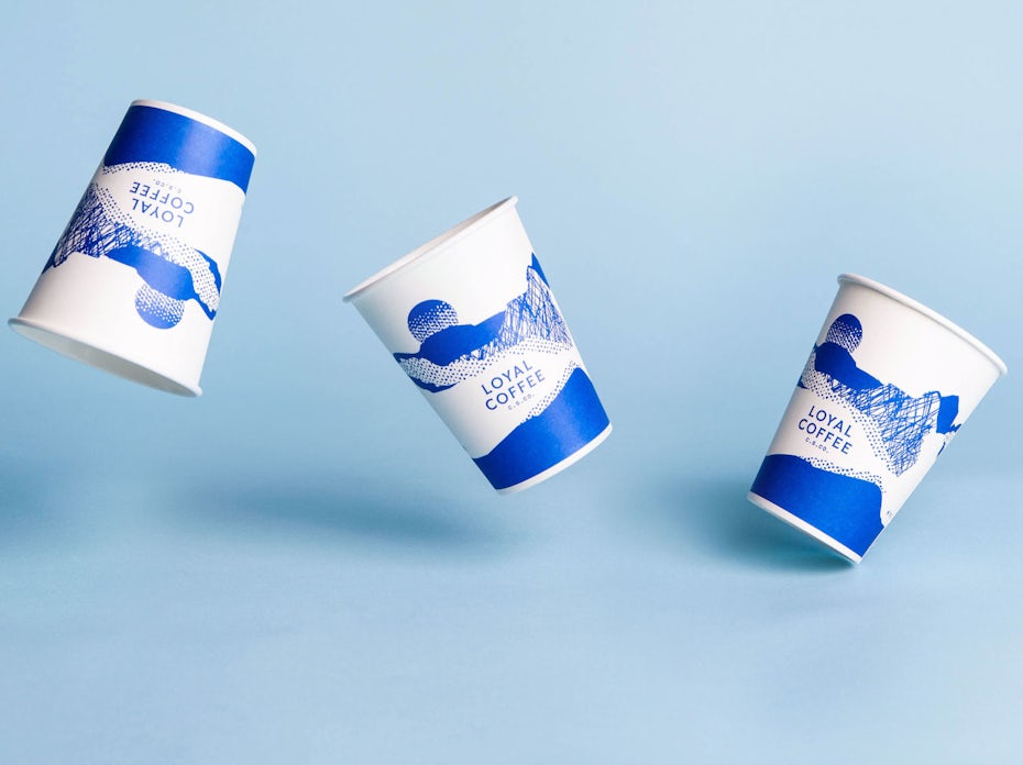
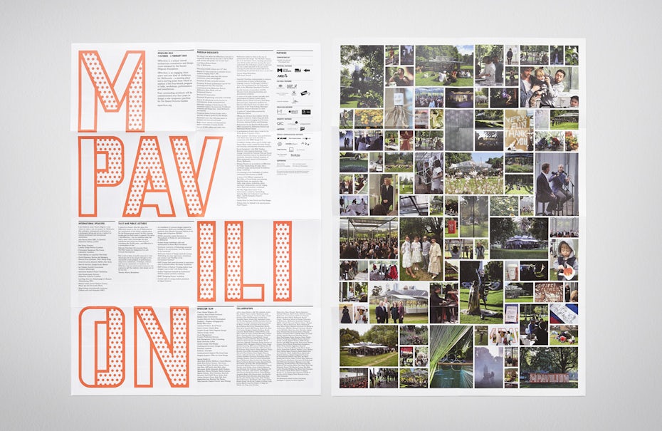
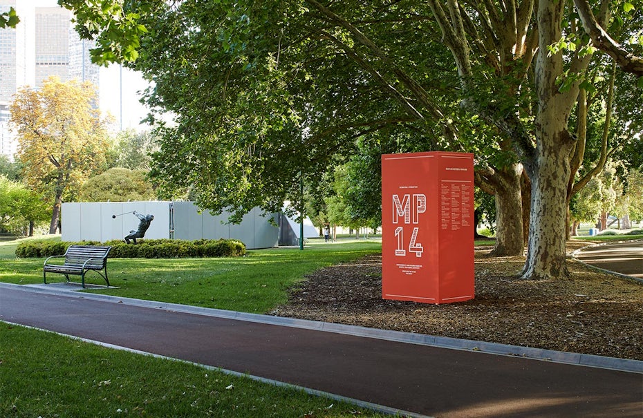
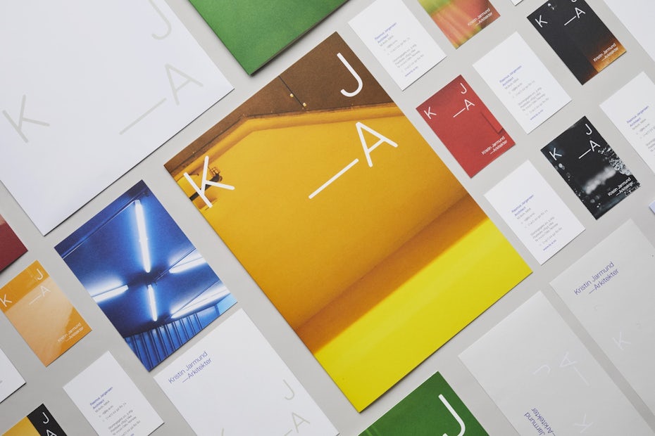

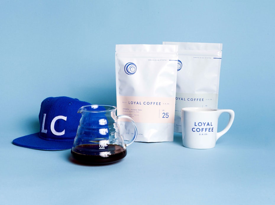
One excellent example of awareness to context can be seen in Snøhetta‘s logo design for Kristin Jarmund Architects, which takes the abbreviation “K J – A”, and allows it to adapt to various layouts upon photographic backgrounds. In this way, the logo accommodates concepts of architecture both metaphorically and visually. Another thoughtful example of awareness to context comes in Studio Mast’s logo design for Loyal Coffee, which includes several iterations of line-based illustration that adapt to coffee cups, menus and coffee bean packaging.
2. Architectural inspiration
While basing a logo design off of an architectural design is nothing new, it’s resurging in popularity in clever, innovative ways. Physical space has always been important in creating a brand identity (think how every Starbucks and Apple store “feels” the same). As we move into an increasingly digital world, designers are finding ways not only to capture the look of architectural landmarks, but also how to embody the concepts behind the physical manifestation of the brand through their visual interpretation. For example ….
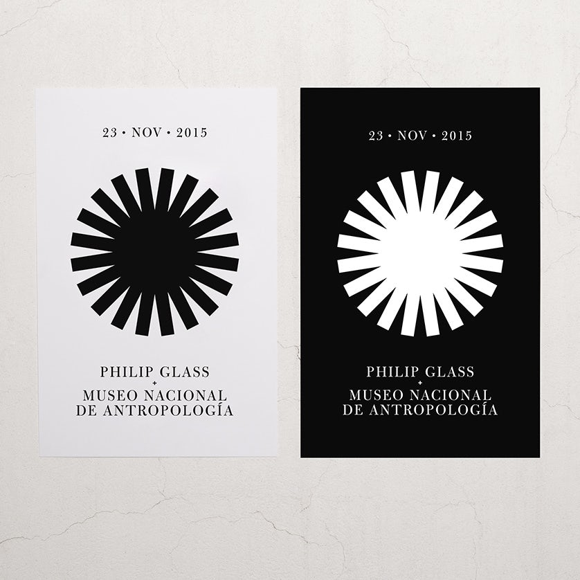
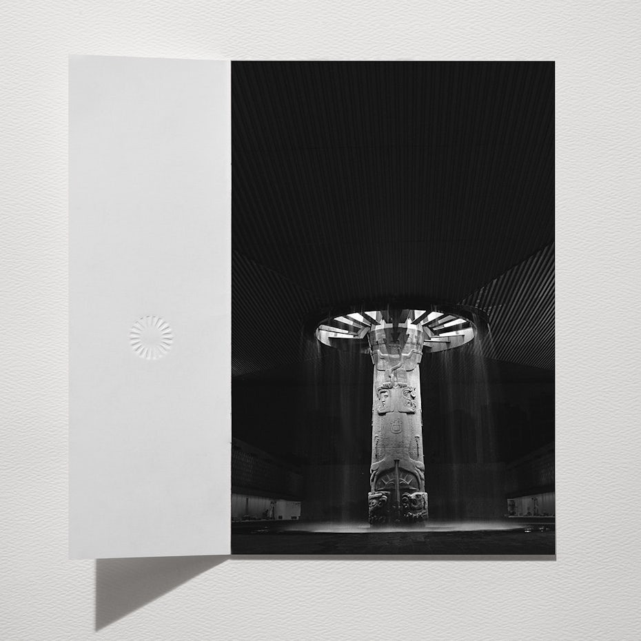
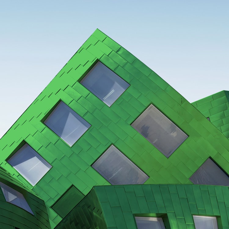
A wonderful example of this trend is Savvy’s logo design for Philip Glass’s concert in the historic National Museum of Anthropology in Mexico City. The shape of the logo is drawn from the main feature of the building, the “Umbrella Fountain,” designed by Mexican Architect Pedro Ramírez Vasquez. This feature is, in essence, a geometric, circular skylight which lets light pour in around a large engraved pilar. It is both massive and stunning—qualities which are referred to in the bold, black and white rendering of the logo. At the same time, the impact of the logo speaks to the qualities of Philip Glass’s work: his music is emotional intensity, and explores its relationship with physical space.
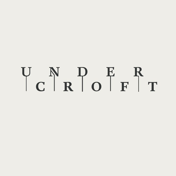
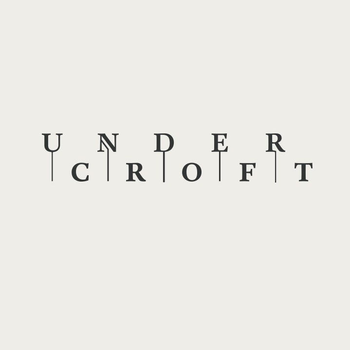
Another nice example of architecture-based logo design can be seen in Föda’s work for Undercroft, a secret cocktail bar underneath a historic church. The bar is entered through a dim archway then down a small stairwell. Inside the bar, there are multiple shelves for storing liquor and books. The logo reflects many of these architectural aspect by creating levels, with lines “pointing” to the underneath layer. The angled line in the “N” even hints at the idea of a small stairwell.
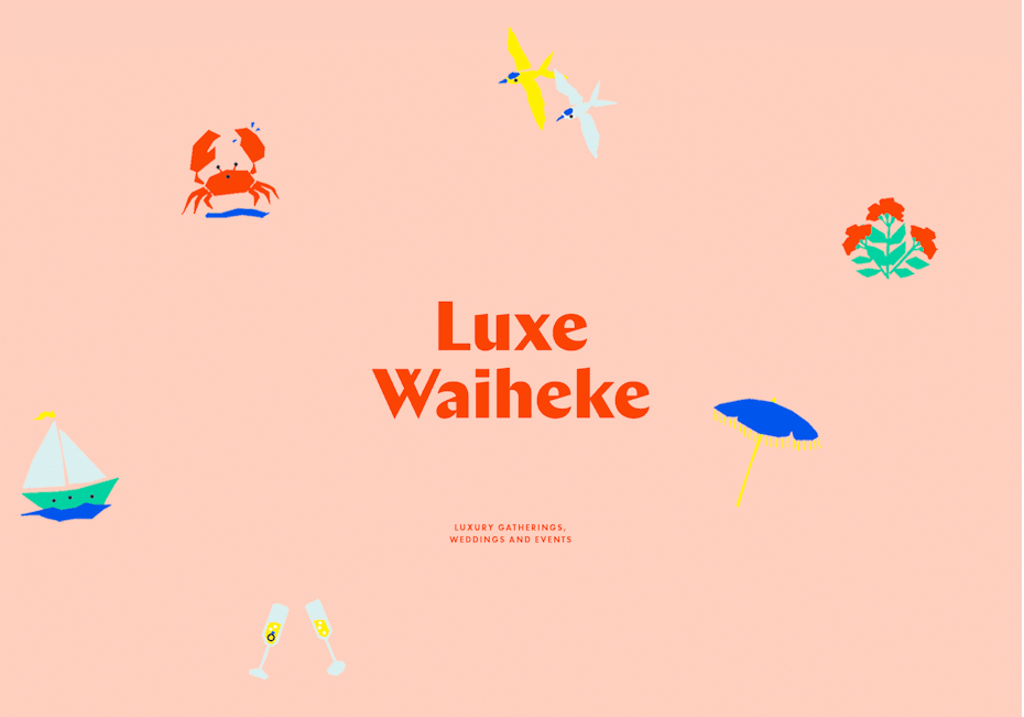
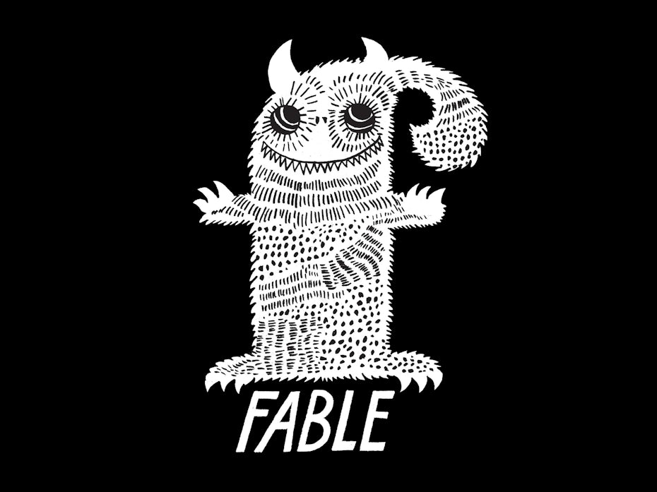
3. Fun! (Creating an energy and vibe.)
Fun is something that sells just about as well as sex. While fun has always been a staple in logo design, the current state of economic uncertainty might be inspiring people to counteract negativity with funner designs than ever! Fun is hard to resist, and it comes in the form of bright colors, good vibes and cute characters. This year we hope to see fun logos left and right, making 2018 a year that makes you smile!
via Bedow.

via Perky Bros.
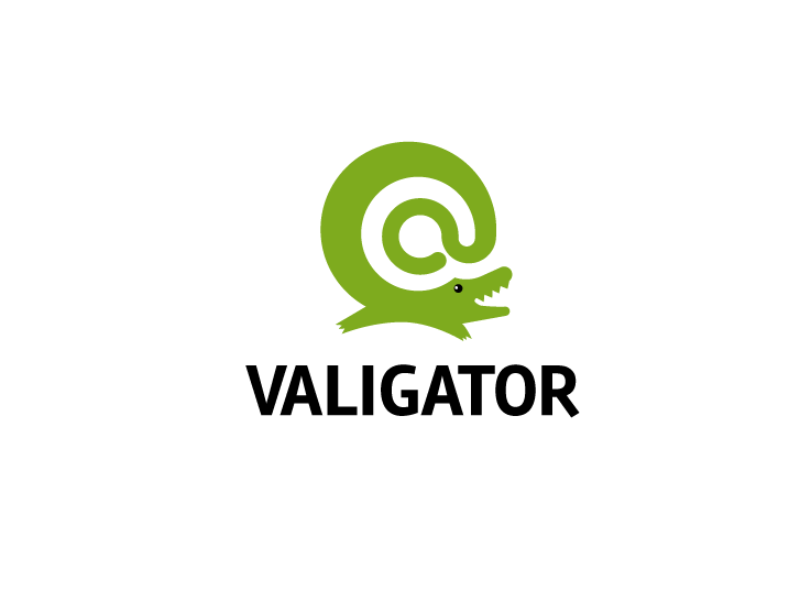
Logo de Valigator réalisé par dan.stiop.

Logo de Cosmic tea réalisé par giyan.
There are many ways to create fun in a logo. Some of our favorite examples from this last year include A Friend Of Mine’s design for Luxe Waihek, which contains joyful custom typographic characters (notice how the “e” makes a laughing emoji style face), Bedow’s logo for Fable Skateboards, which contains a whimsical smiling monster and 99design’s own giyan’s design for Cosmic Tea Co. which features an astronaut sipping tea in space!
4. Pushing metaphors to the extreme
Metaphors are certainly not new to logo design, but the ever-expanding reach of curiosity and creative exploration in the design community has recently caused them to become a focal point of deep creative exploration. This year we should see logo designers pushing metaphors to their extreme, with thoughtful and clever concepts that give more depth to a logo than visuals can alone.
Logo avec métaphore du lacet, via Perky Bros.


Les traits du corps, réalisé par Arthean.

Logo inspiré des molécules chimiques, via InHouse.
Above, the designers at Perky Bros have created a perfect dual metaphor for Run Mfg, where a shoelace not only nods to a running shoe but also depicts paths or routes. This not only explains what Run Mfg does (running event planning/design), but it also opens up for creative possibilities in the branding.
We also love how InHouse has broken out the typographic characters of “Pacific Potion” to create a beautiful “chemistry diagram”. This creates a metaphor of wine as chemistry, and works especially well for a wine brand that pays especially detailed attention to the ingredients, ratios and science in their wine making process.
To read the rest of the article please click here to continue to the original site courtesy of 99Designs
Leave A Comment