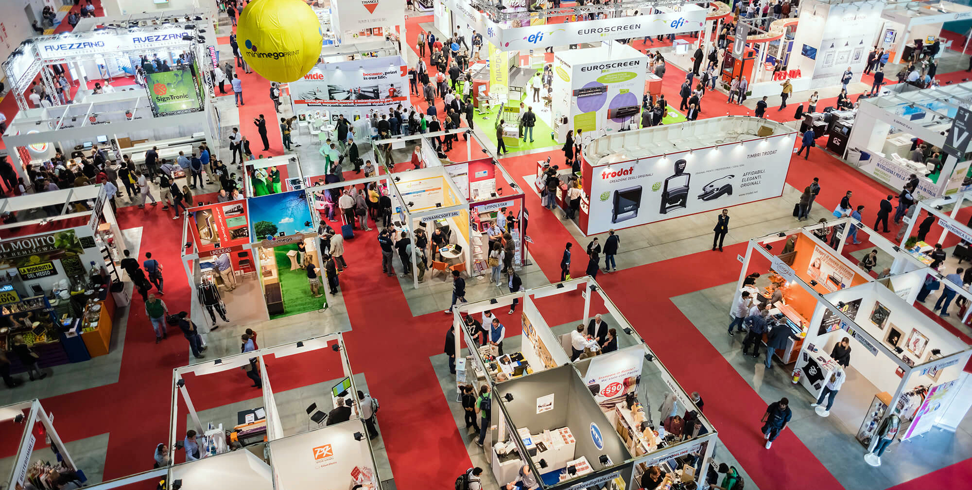
Do you know what makes a good exhibition stand?
To view the original article courtesy of Due, click here
When it comes to exhibiting, are you spending your budget wisely? Do you know what will drive your ROI and what fritters away your budget without making any difference?
We asked 180 savvy marketers at both Marketing Week Live 2017 and Technology for Marketing 2017 in what proportion they would allocate their budget on an exhibition stand if it was split between three elements:
- The basic structure/architecture of the stand
- The engagement tools to create a memorable experience
- The design features and graphic design
Use the illustration below to compare how you’re currently spending your budget (with 3 spoons equating to the largest amount and 1 spoon equating to the least amount spent) then read on to discover the perfect recipe to maximise ROI…
The recipe for a great exhibition stand
Much like making a cake, there is a recipe for building an exhibition stand that hits a sweet spot when it comes to delivering ROI:
- 1 part architecture
- 2 parts design features/graphics design
- 3 parts engagement tools
From our research, 65.5% of MWL marketers and 36.8% of TFM marketers know that this is the right recipe to make a stand that delivers great ROI.
If this recipe is not followed, your stand design could be falling flat, or not be delivering the best ROI that it can.
1 part architecture
 71% of marketers agree that the least amount of budget should be spent on the underlying architecture of an exhibition stand.
The architecture has an important role in holding up your stand, but on its own won’t attract attention. This is why the least amount of budget should be spent on it.
To make sure you can keep the structure as the lowest cost, consider the long term investment to reuse your structure at multiple events verses hiring it.
If you don’t exhibit often or have different stand space dimensions for each show, then hiring your stand structure can make a significant difference to your budget.
2 parts design
 Most marketers agree (70% of them) that the design of the stand should be the second most important thing to splash the cash on when it comes to designating budget.
The design and build of a stand, including graphics and how the stand works ergonomically can make a huge difference to bring people on-stand and provides the right setting for your sales team to talk to visitors.
It can attract attention from afar and bring in people who are eager to learn more about your brand.
3 parts engagement
 Now that you’ve got the architecture and stand design sorted, the most important thing you’ll need to focus on is how you’re going to make your stand memorable.
It’s so important in fact, that 79% of marketers agree that most of your budget should go on engagement.
Keeping your visitors entertained, imparting knowledge and making sure that your brand is the one that they remember with a smile on their face at the end of a show is the difference between a good stand and a great one.
It’s also the difference between them deciding that you are the company they want to work with and them forgetting you after the show.
Make sure your stand is memorable by using clever engagement tools to build upon your brand and campaign messages.
It’s a piece of cake!
When used correctly, these three elements can really help to deliver a great ROI and importantly a stand that is memorable to visitors. It’s a piece of cake!


Leave A Comment